Numbers May Not Mean Anything

Several business projects followed by a nasty case of the flu have silenced me recently. My apologies. While trying to beat the bug I received an email with a table outlining performance numbers for certain “model” portfolios run by a major Italian bank in the asset management field. The fever went up again soon afterwards.
Numbers are supposed to help in determining actions or interpreting facts. Suppose you are faced with the following matrix (for Euro-based portfolios):
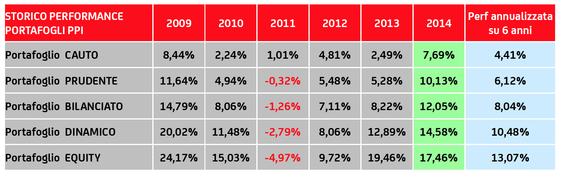
A superficial analysis reveals lots of positive numbers (in black) and reasonable sizes as well (a good portion of them are double-digit). A light green column highlights what a fine year 2014 was, whereas a light blue one recapitulates the last six years in annualized terms. You will feel well disposed to discuss investing under these auspices, despite a footnote that says “management costs” are not included in the above figures. Why? Not relevant? ”Good” numbers justify any cost? Subject perhaps for a future post.
A more critical analysis should at least make you reflect on a few important unknowns:
“Why does this history start in 2009?”
“What do the portfolio names mean in terms of allocation?”
“What has the risk and/or volatility of the portfolios been?”
“Is there a comparable passive alternative? A benchmark?”
“What variables were the managers allowed to operate on? (Asset allocation, security selection, currency, etc.)”
“What does the DINAMICO portfolio do exactly, and why is it positioned between BILANCIATO and EQUITY? Is a BILANCIATO a ‘stiff’ DINAMICO?”
I could go on; in short, more questions than answers. The table does not really inform you. And, what’s worse, there is no way for you to do anything except, if you wish, pick up the phone and call a rep of the bank for a talk. With this kind of “business card” I would not bother: it’s a set up to lull you into the overoptimistic shadow of an exceptionally good market half-cycle. It has all the right ingredients for leading you down the wrong path.
The half-cycle I mentioned above is also responsible for these numbers, all 10-year government rates (at mid-morning of February 3). They are very significant and the amount of information they contain is huge:
Switzerland -0.20%
Germany 0.33%
Japan 0.36%
Holland 0.38%
France 0.55%
Sweden 0.59%
To think we live in a world where some people are willing to lend money to the Swiss government for 10 years – or to the German and Dutch and Swedish ones for up to 5 years, or to the French one for up to 3 years – and lock-in a guaranteed loss is something that should stop you in your tracks. You should realize these yields are what helped the Italian bank produce the numbers in the table, however good or bad. When monetary policies do change I don’t think equity prices or other forms of corporate risk will be left intact.
Photo source: http://blog.gwcollegedemocrats.com/picsvqzp/jasper-johns-numbers-in-colour; Jasper Johns “Numbers in Color”, 1958-59.
Not only that there are no information on the risk but only on the reward in a bullish market like 2009-2014 (except some hits for european assets in 2011 due to the greek debt cut) I especially like the fact that they do this before management cost. But at least the used the geometric mean for the average annualized return.
The fact of deletion through numbers reminds me of a story told by Schiller in his financial market classes about this guy having an awesome performance in the first two years in a row and nearly doubled the portfolios value but lost 100% in the 3rd year. If you use the wrong measure you could still promote your portfolio has grown by 60% on average… So whenever there are numbers and statistics check the footnotes and be aware about the quote of Winston Churchill: “Do not trust any statistics you did not fake yourself.”
Good point about the geometric mean; I didn’t even think of it. Must have been the fever…