1Q84

As in Murakami’s novel, reality can be ambiguous. Make sure you can find your way back – or forth – to the one you want.
In 1989, Robert Shiller – the same Shiller of Irrational Exuberance fame – wrote a much less accessible book, Market Volatility. In it, he makes the case that market prices tend to move with much higher volatility than the underlying fundamentals would justify. It is interesting how most investors and their advisors regularly ignore this fact, reducing the act of investing to one of trading and pricing pieces of paper (or their electronic equivalent). Understanding and tracking the cash flows associated to those investments is at best an abstraction.
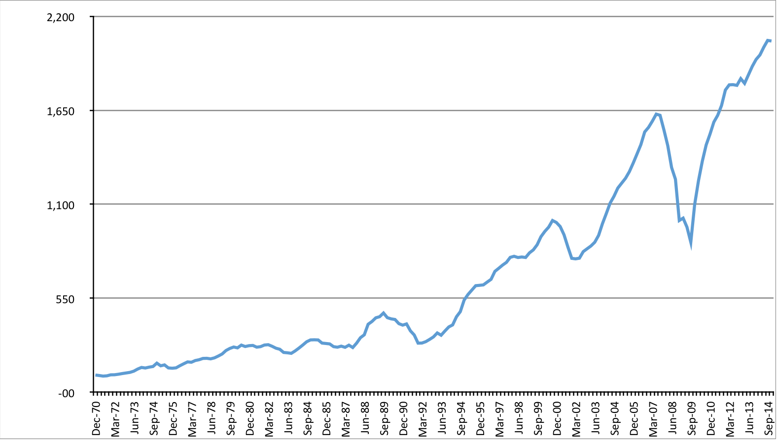
Suppose at the end of 1970 you purchased the US S&P 500 Index. The following graph is the evolution (normalized, with 100 = December 1970) of the quarterly price of that Index; this series exhibits an arithmetic average return of 2.1% with a standard deviation of 8.2% (a ratio of 3.9 times the return):

If we look at the underlying earnings during the same period – a rough equivalent of the economic cash flows you purchased when you invested in the index – we get the following normalized graph (average return: 1.9%; standard deviation: 5.4%; ratio: 2.9):
As another form of underlying cash flow – perhaps more tangible but not necessarily more valuable – we can look at dividends paid during the period; here’s the graph (average return: 1.5%; standard deviation: 2.0%; ratio: 1.4):
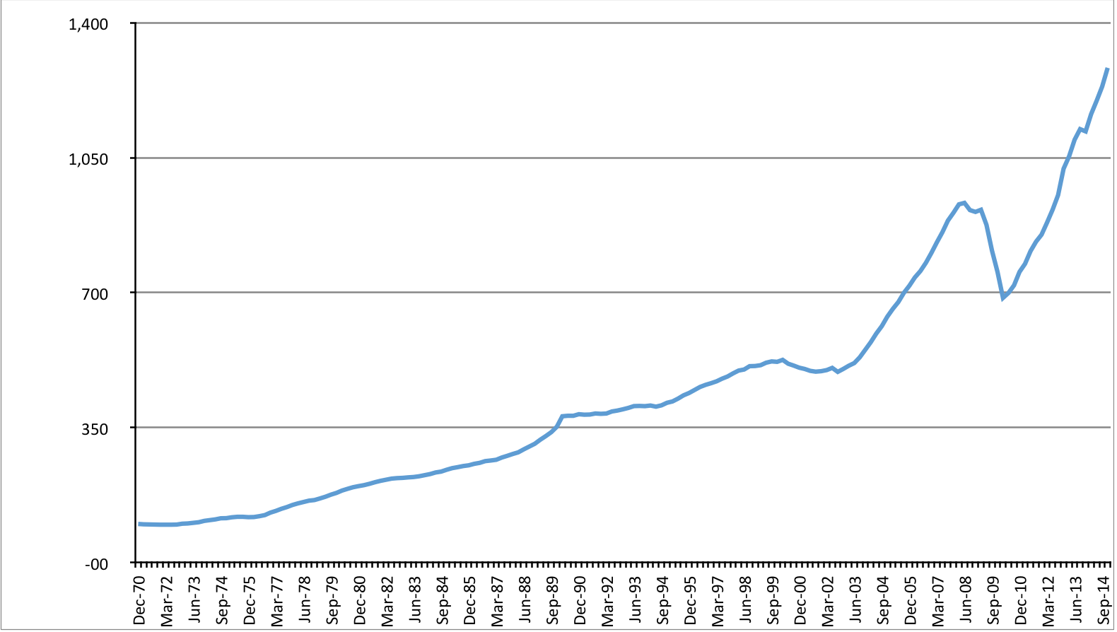
A cursory look at the three graphs above will tell you the series represented are shown in order of broadly decreasing volatility. For confirmation, here’s one graph with all three of them:
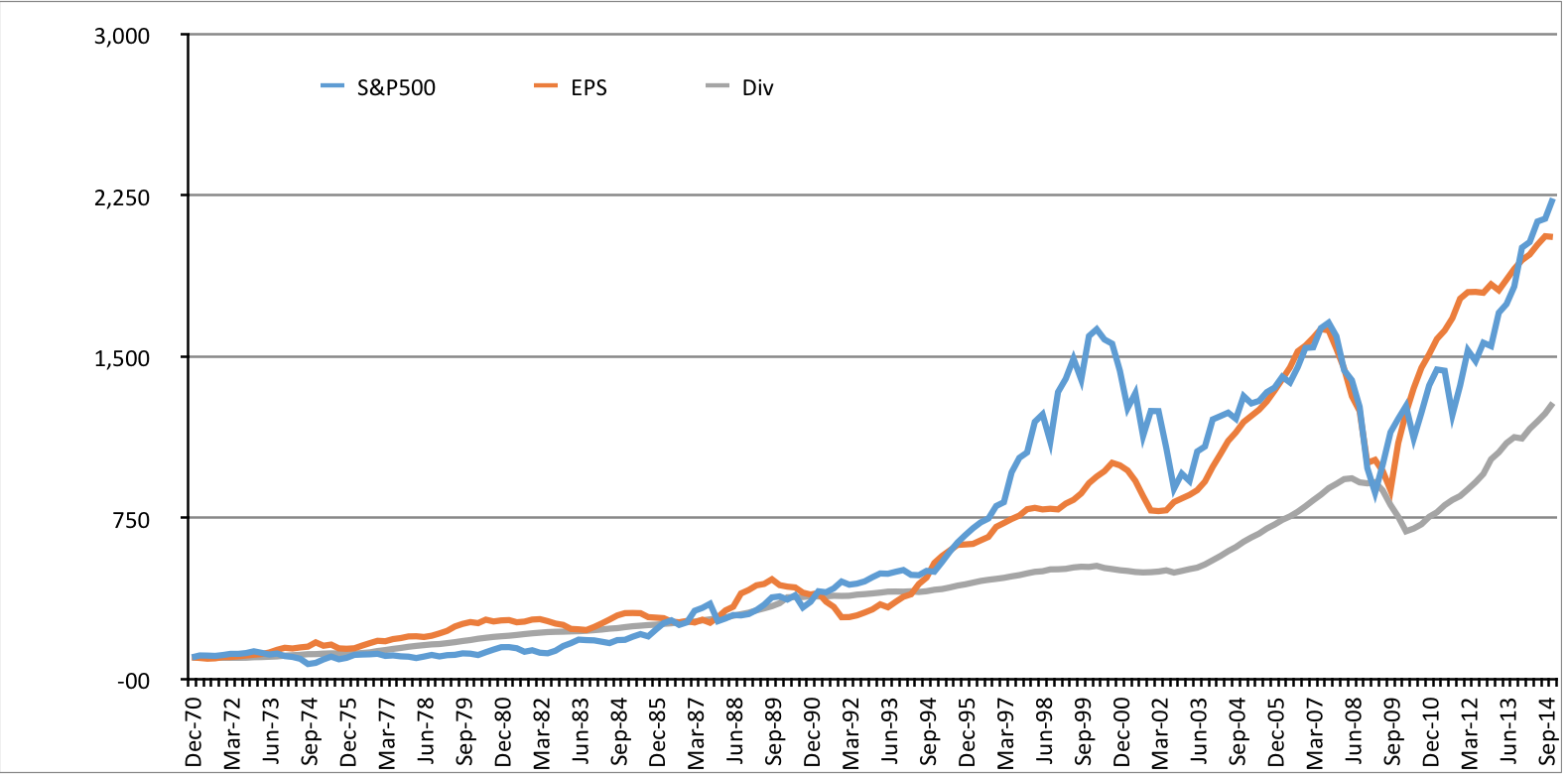
It is evident that the price dimension (blue line) is only one of at least three alternatives you can use to value your holdings. Cash flows (orange and grey lines) – however defined – produced from those investments are another. By observing the periodic divergence and convergence of the lines in the last graph you realize there are times when those same cash flows are more accessible (or cheaper) than otherwise. Finally, for the nervous among you it should come as great comfort to know that the market price on any tradable security may be meaningless if you have access to real benefits of another nature.
Why don’t we see more of this type of analysis on portfolios when meeting advisors? I can suggest a few possibilities:
- None of it is relevant to the task at hand;
- It costs too much to program advisors’ systems to produce the data;
- Investors focus on investment results and not the process of investing: “as long as something goes up I’m happy”;
- Investors are not investors but traders at heart;
- Cognizant of numbers 3 and 4, advisors focus on more “useful” things: research, market advice, timing, economic forecasts, etc.
Take your pick, or add your own reasons. As in 1Q84, unless you like the Little People and their world, you need Aomame’s memory to know your way out.
Photo source: Wikipedia. Graph sources: Bloomberg; own analysis.
Dear Roberto, as always a great post!
Allow me to be thought-provoking with a further literary quotation: Flatland a Romance of Many Dimensions, a satirical novella by the English schoolmaster Edwin A. Abbott, first published in 1884. The story describes a two-dimensional world occupied by geometric figures, whereof women are simple line-segments, while men are polygons with various numbers of sides. The narrator is a square, a member of the caste of gentlemen and professionals, who guides the readers through some of the implications of life in two dimensions. The Square dreams about a visit to a one-dimensional world (Lineland) inhabited by “lustrous points”, and attempts to convince the realm’s monarch of a second dimension; but is unable to do so. He is himself visited by a three-dimensional sphere, which he cannot comprehend until he sees Spaceland (a tridimensional world) for himself…
Like the narrator in the novel, most advisors live in a world that struggles to exit from an investment dimension made out of equities, of the S&P500 (or other mainstream indexes) and of plain vanilla bonds. This is also a function of the all powerful sales machine, called wall street, that lies behind these securities, and pushes them to the mainstream world via every form of mass communication available, making for a strong current, easier to flow with than to row against.
If we make the effort to try and escape from a mono-dimensional world where equities valuations have become the proxy of anything financial, including economic activity and growth, we may discover that tactically there are more ways to capture those valuable cash flows that you rightly bring to the centre of your thinking.
Capital structures of large companies are ever more complex and cyclical opportunities for picking up those cash flows, other than via equities ownership exist, and inefficiencies are at times higher in less mainstream securities, particularly if one brings into the equation seniority within those capital structures. Securitized cash flows and complex or less liquid credits are examples, that may also have large embedded optionality.
One other advantage of disregarding equity indexes and other proxy’s of relative performance, is freeing the mind of the client and of the advisor of all the noise and greed promoted by the street, that often forces us to do exactly the wrong thing at the wrong time.
The S&P and most other indexes are a very limited tool to assess investment decisions, unless one is just indexing.
These indexes are distorted by capitalization weighting and by substitutions of their components, therefore they are an evolving entity. The S&P in 1970 is a very different portfolio compared to the S&P in 2014. These are great marketing tools to convince us that investing in equities is great, but in reality what would the performance of the Dow jones look like if we computed it with its original components? or of any other index for that matter?
It would be great to see a study of the real performance of all these widespread indexes, without the capitalization weighting and without the substitution of their components over time… Historical equity returns would look very different.
Whatever the case, the leap into the absolute return dimension from the benchmarked world, seems to be as difficult for advisors, as it is for investors, just like our narrator in Flatland, that struggles to understand the concept of a tridimensional world!
Wall street isn’t going to finance anyone to promote this quantum leap!
Thank you for your inspiring posts, keep it up!