
Where’s Brexit?
The story of a week in 14 charts.
Remember Where’s Waldo?, the mesmerizing children book? How many hours did you spend looking for the bespectacled little guy? If you have no children you’re exempt from responding.
It was easy to find “Brexit” over the past week; in fact, it was about the only word you heard upon waking and going to sleep. While it’s still way too early for any conclusions I decided to see if the event lived up to general expectations in terms of market changes. I realize this is a very narrow window on the complex reality, but you will find in the following 14 charts (preceded by summary Table 1 where I group the represented variables in three arbitrary categories) at least some counter-intuitive answers, especially since the June 22-29 week was a fairly normal one in terms of economic data.
My conclusion is that so far things have been under control, with currencies absorbing the brunt of the reaction and marginal signs of “fear” primarily captured by gold (and possibly the Yen as well).
Happy Where’s Brexit to all (and 4th of July to America).
Table 1
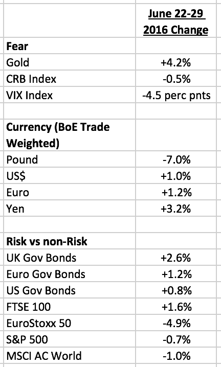
Figure 1 – Gold
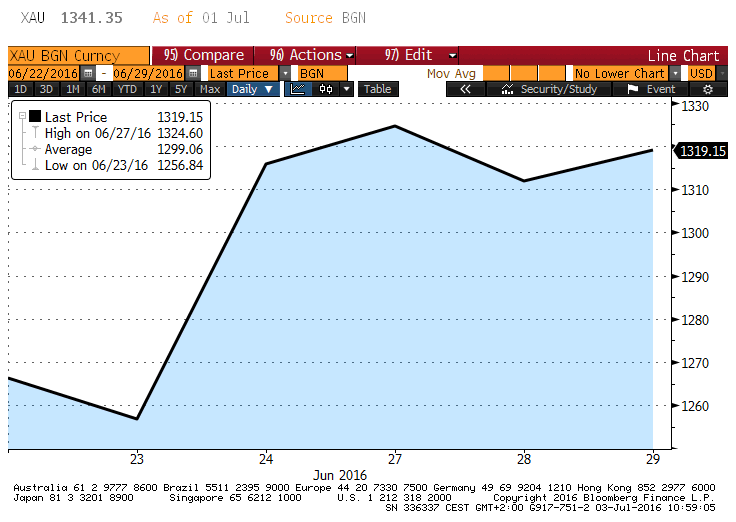
Figure 2 – CRB
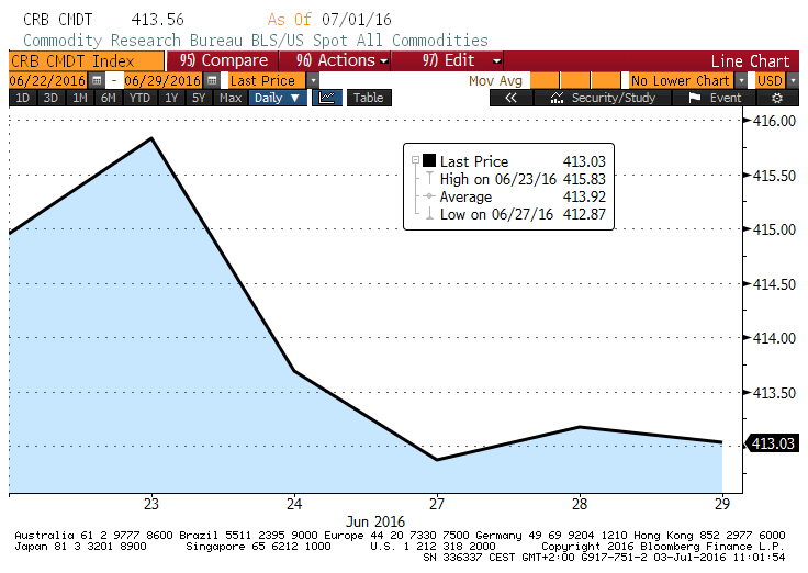
Figure 3 – VIX Index

Figure 4 – Pound (BoE Trade Weighted Index)
Figure 5 – US$ (BoE Trade Weighted Index)
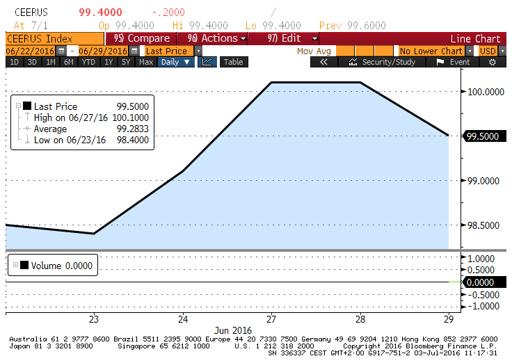
Figure 6 – Euro (BoE Trade Weighted Index)
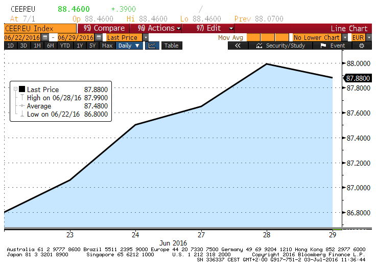
Figure 7 – Yen (BoE Trade Weighted Index)

Figure 8 – UK Government Bonds

Figure 9 – Euro Government Bonds
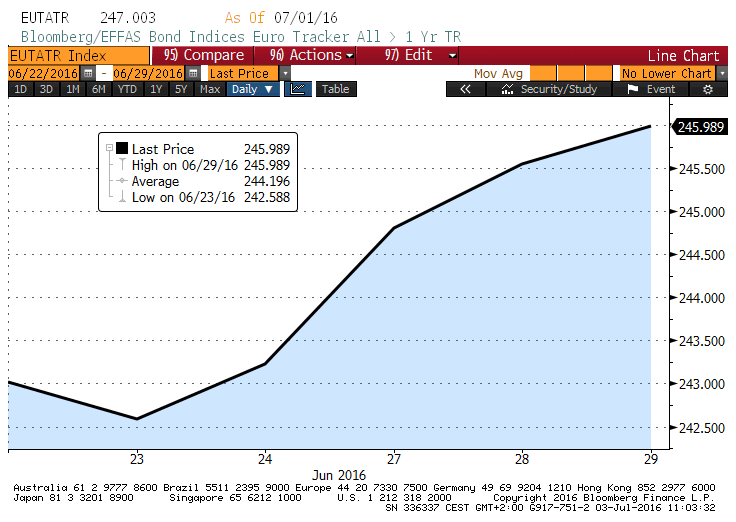
Figure 10 – US Government Bonds

Figure 11 – FTSE 100

Figure 12 – EuroStoxx 50
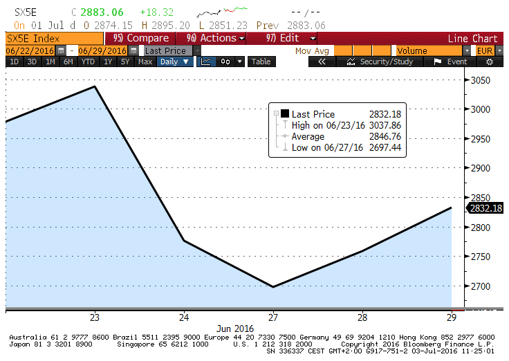
Figure 13 – S&P 500

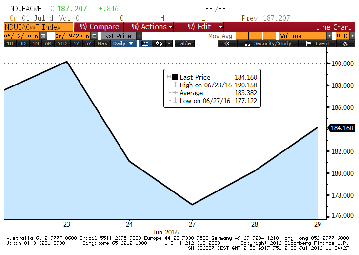
Figure 14 – MSCI All-Country World (in US$)
-Photo Sources-
-Cover: https://www.reddit.com/r/todayilearned/comments/34a1kn/til_waldo_from_the_popular_wheres_waldo_childrens/
-All other charts: Bloomberg; author’s calculations.